

Summary
Why Does AI Pick 7 - and Why Do AI-Built Websites Look Alike?
Why Does AI Pick 7 - and Why Do AI-Built Websites Look Alike?
- Author: Georgi Papucharov
- Created at:
- Time to read: 8 min.
In short: A prompt such as 'build a modern website for a tech business' leaves crucial decisions unanswered: audience, brand, conversion goal, content and functionality. The generator fills those gaps with plausible defaults. Much like a familiar number in a casual answer, familiar design patterns become the path of least resistance. That can be useful for prototyping; it is a problem when a prototype is mistaken for a finished product.
Why did AI choose the number 7?
I asked ChatGPT to generate a number between 1 and 10. It answered 7. When I asked why, it explained that there was no particular reason, although seven is a number people often associate with a random choice. One exchange does not prove that every AI model favors seven. It does, however, introduce a useful question: why do AI-generated websites so often look familiar?
How does AI choose what to generate?
Language models learn statistical relationships in text and generate responses according to context and sampling settings. A request to 'pick a random number' does not necessarily invoke a uniform random-number generator. For websites, output also reflects popular design conventions, reusable components, tool templates and vague requests. Temperature can affect variation, but more randomness does not automatically produce better design.
What does seven have to do with website design?
A prompt such as 'build a modern website for a tech business' leaves crucial decisions unanswered: audience, brand, conversion goal, content and functionality. The generator fills those gaps with plausible defaults. Much like a familiar number in a casual answer, familiar design patterns become the path of least resistance. That can be useful for prototyping; it is a problem when a prototype is mistaken for a finished product.
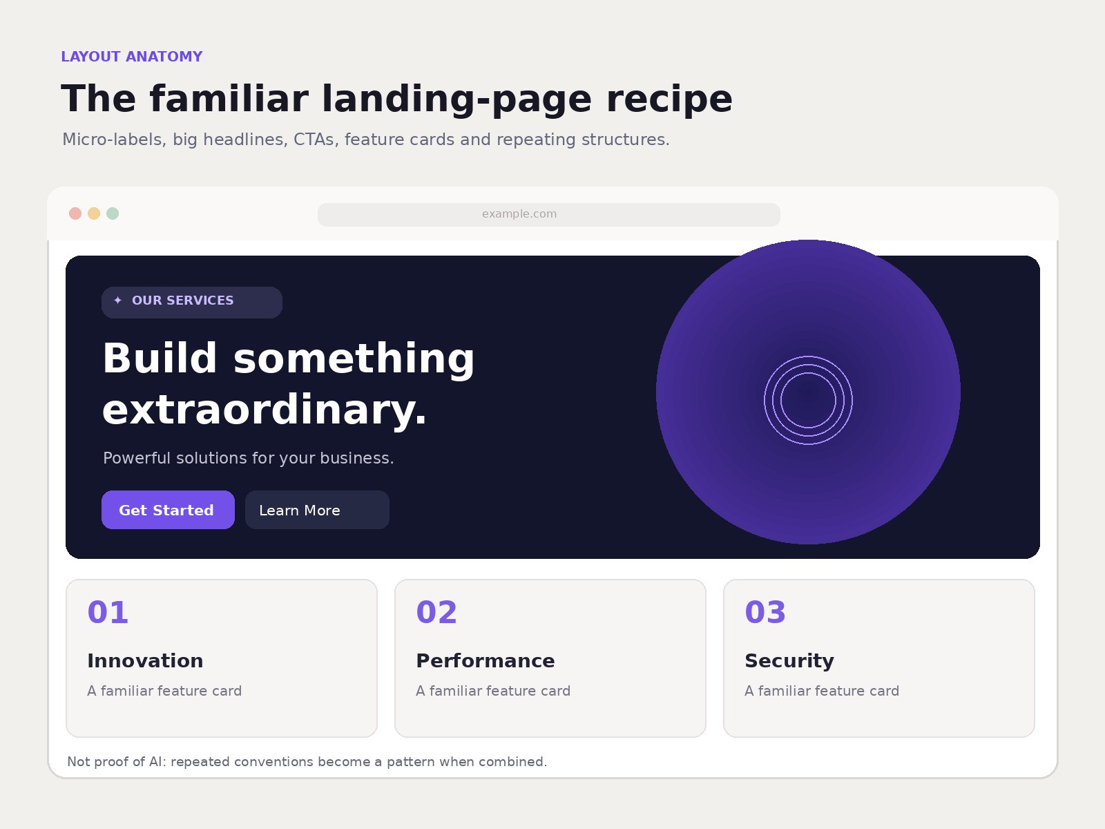
Illustrative example of a common layout - not proof of AI.
18 signs of a generic AI-generated website
These are observable patterns, not forensic proof of authorship. Human designers use gradients, grids and numbered cards too. Look at the combination of repetitive visual design, generic claims and incomplete functionality, not a single decorative element.
1. Purple and blue gradients
Dark backgrounds, neon buttons, glowing orbs and purple-blue halos are common in technology landing pages. Ask whether the same look actually suits a law firm, warehouse or property developer.
2. Three interchangeable benefit cards
'Innovation', 'Security' and 'Speed' in three matching cards may be tidy but say little. Try replacing the company logo with a competitor's. If the message still works unchanged, the content needs more substance.
3. The default hero layout
An enormous headline, vague promise, two buttons and an abstract illustration. This is a legitimate layout convention, but it should still communicate an audience, a concrete offer and a clear next action.
4. A dashboard that does not exist
Revenue charts and growth figures can look like authentic product screenshots when they are merely decorative. Check whether visuals represent real software or are clearly labeled as concepts.
5. Buzzwords instead of answers
'Unlock your potential', 'Revolutionize your business' and 'Next-generation solutions' are not proof of AI, but they rarely tell potential buyers what the business actually delivers.
6. Numbers with no evidence
Claims like '500+ clients', '99.9% success' or '10x faster' require definitions, a measurement period and evidence. Auto-generated content is not an excuse for invented statistics.
7. Unverifiable testimonials
Generic names, obscure companies and polished praise without projects or context deserve verification. Look for attributable case studies or independent references.
8. Every section repeats the same promise
Digital transformation in the hero, transformative digital solutions in the service cards and transformation at the bottom. Repetition often substitutes for concrete details about work and results.
9. Mixed languages and unfinished localization
English buttons on an otherwise Bulgarian website, inconsistent headings or translated fragments can indicate an unedited template or automatically generated draft.
10. Buttons without a meaningful destination
'Learn more' returns to the homepage; 'Book a demo' opens a generic contact page. Test each primary action against the promise printed on the button.
11. Forms that simulate success
A contact form displays a success message but does not deliver an email or create a CRM record. Site owners should perform an end-to-end test with a known test inquiry.
12. Functionality that exists only visually
A search box that does not search, filters that never affect results, or a login button without authentication. A convincing screenshot is not working software.
13. Poor mobile behavior
A polished desktop screenshot may hide overlapping elements, clipped headings and unusable menus on smaller screens. Test real device widths and keyboard interactions.
14. Placeholder details still in production
'Lorem ipsum', '123 Main Street', '[email protected]', fake inventory and demo pricing suggest incomplete quality assurance, whether AI was involved or not.
15. Starter-template fingerprints
Browser titles such as 'Vite + React', default favicons and platform watermarks reveal unfinished setup or the tools involved. React, Next.js or Tailwind alone do not indicate AI authorship.
16. Micro-headings above every H1 and H2
Small eyebrow labels such as 'OUR SERVICES', 'WHY US' and 'HOW IT WORKS' appear above nearly every major heading, often in uppercase or pill-shaped badges. The warning sign is mindless repetition, not the label itself.
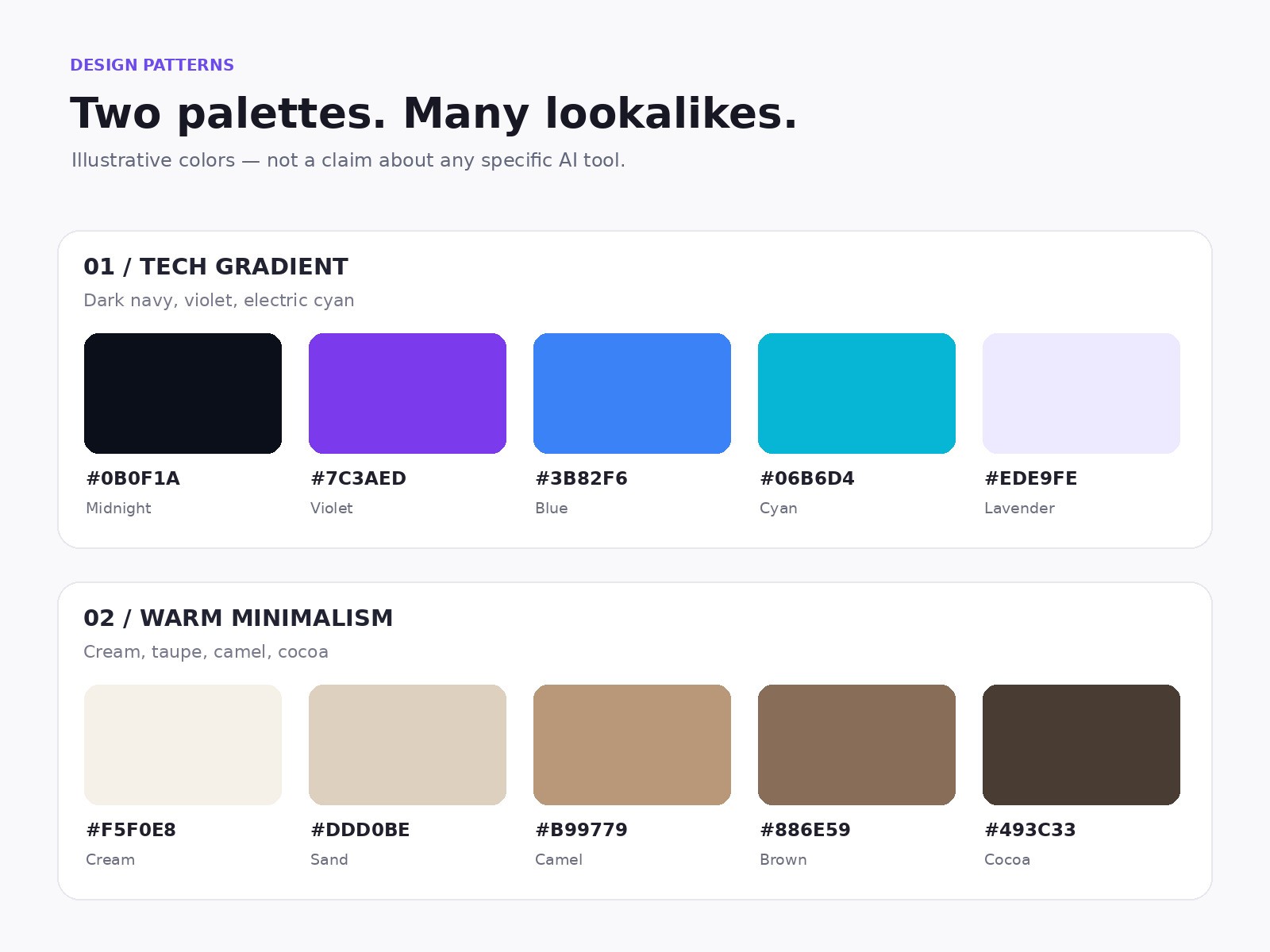
Two recurring visual directions with concrete HEX color values.
17. Warm beige and brown everywhere
Cream, camel, taupe, warm brown, fine dividers and generous whitespace form another recognizable premium-minimalist template. A palette should support a brand, not substitute for one.
Illustrations are schematic and are not outputs of an actual benchmark.
18. Numbered cards from 01 to 06
'Discover → Design → Develop → Launch → Optimize → Scale' displayed in six identical cards suggests process. But if the company does not actually work this way, the numbering is merely decoration.
Why do these patterns keep appearing?
AI did not invent eyebrow labels, beige palettes or numbered steps. Designers developed them. Interface generators can reinforce existing fashions by assembling familiar conventions and reusable components quickly. Similar prompts and component libraries contribute too. There is no single universal AI design fingerprint.
| Pattern | Proof of AI? | What to check instead |
|---|---|---|
| Purple gradient | No | Does it fit the brand? |
| Eyebrow above every section | No | Does it add meaning? |
| Six numbered cards | No | Is the process real? |
| Invented testimonials | No, but a serious issue | Are sources verifiable? |
| Form without delivery | No, but a functional defect | Did the inquiry arrive? |
How to tell a beautiful mockup from a usable website
Test the primary call to action, contact forms, search, filters, mobile navigation, internal links and content accuracy. Navigate with a keyboard, inspect form labels and color contrast, and verify an inquiry reaches its destination. These tests matter more than guessing the generator.
| Check | Attractive mockup | Production-ready site |
|---|---|---|
| Contact form | Shows success | Delivers and stores the inquiry |
| Search | Decorative input | Actual results and filtering |
| Mobile | Desktop screenshot only | Tested across screen sizes |
| Accessibility | Visual only | Keyboard, contrast and labels |
| Content | Generic claims | Verified facts and offers |
A reproducible comparison, not a fabricated experiment
For a fair test, give several website generators the same prompt: 'Create a website for an AI automation company.' Compare layout, copy, colors, actual functionality and mobile usability, recording dates, versions and screenshots. This article does not claim that such a test has already been conducted. Its visuals illustrate common layouts, not recorded outputs from specific tools.
How to get an original result from AI
Avoid the bare instruction 'make me a modern website'. Provide target personas, customer tasks, brand constraints, real offers, competitors, required integrations and acceptance criteria. Ask for clearly different concepts and explicit trade-offs. Include human design, engineering and QA review where risk warrants it.
Can an AI-built website be professional?
Absolutely. AI can speed up research, prototyping, implementation and testing. Quality still depends on requirements, architecture, accessibility, security, testing and maintenance. A small brochure site and a commerce platform handling customer data require different levels of scrutiny.
How does Sirius Software use AI in design?
At Sirius Software, we use AI to speed up design, not to replace the designer. Our UI/UX specialist defines the structure, user journeys and visual direction. AI helps explore ideas, create variations and reduce repetitive work, but every generated screen is reviewed and, where needed, reworked by a person.
Internally, we call this “humanizing” the design: turning an AI suggestion into a solution for a particular business and its users. If AI suggests six numbered cards, the designer might replace them with three meaningful steps or a completely different interface.
Our principle: a person sets the direction, AI accelerates the work, and a person remains accountable for the result. This is a human-in-the-loop approach: we do not accept generated output merely because it looks attractive.
Conclusion: the problem is not AI but default thinking
Seven is a useful metaphor: a familiar answer is not the only possible answer. The question to ask about a website is not 'Can I spot AI?' but 'Does this design serve real people and business goals?'. Sirius Software treats AI as a development tool and judges delivery by usability and reliability. If your AI-built website is heading into production, an independent technical and UX review is a sensible next step.
Related reading: Vibe Code Rescue · Business software upgrades.
Източници / Sources: OpenAI - Text generation; W3C WAI - Easy Checks; Google Search Central - Helpful content. Проверка / reviewed: 28.10.2026.
Other articles
Read more articles from Sirius Software
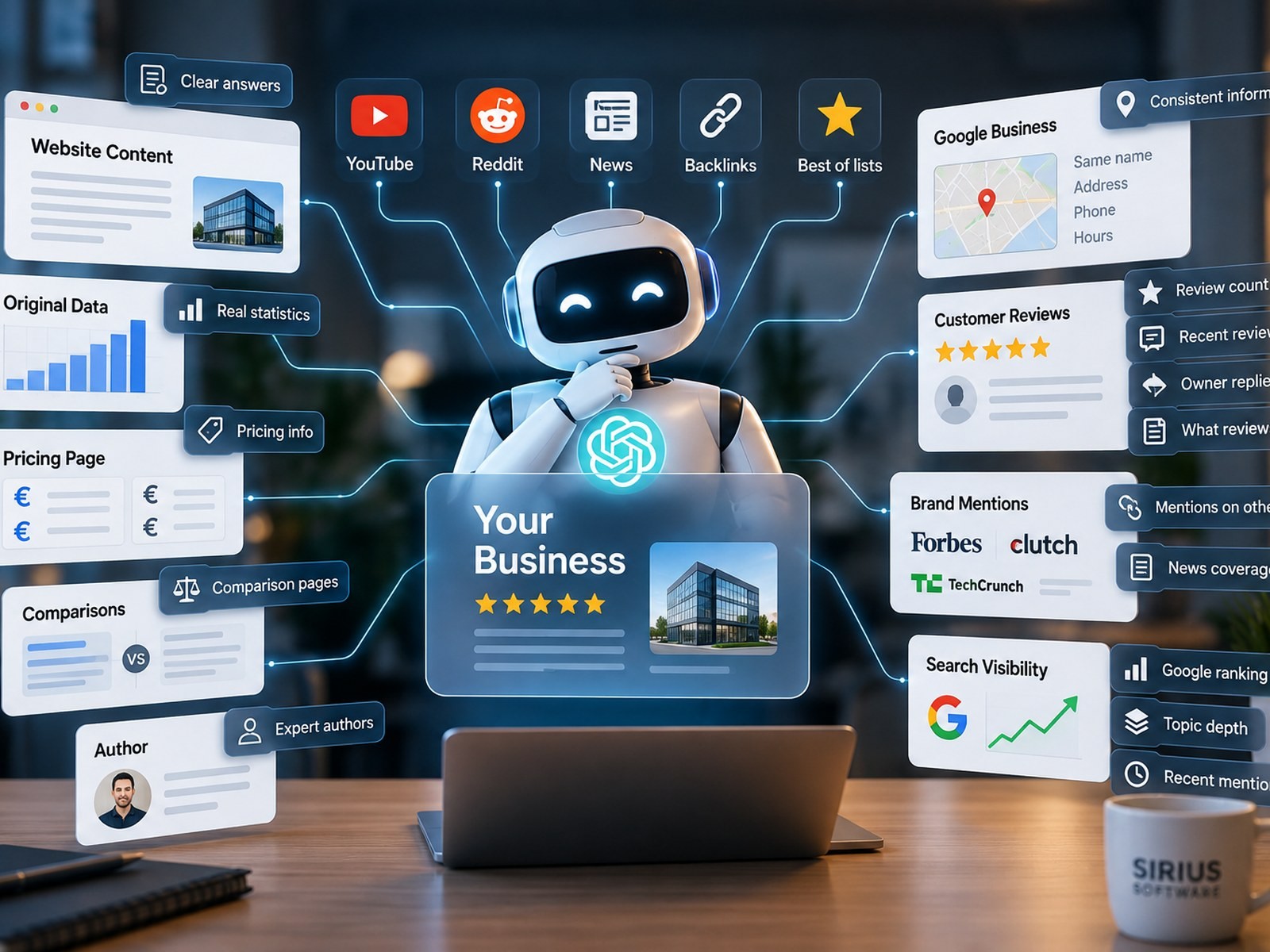
How Does AI Find and Recommend Businesses? 25 Visi...
- Created at: 2026-10-30